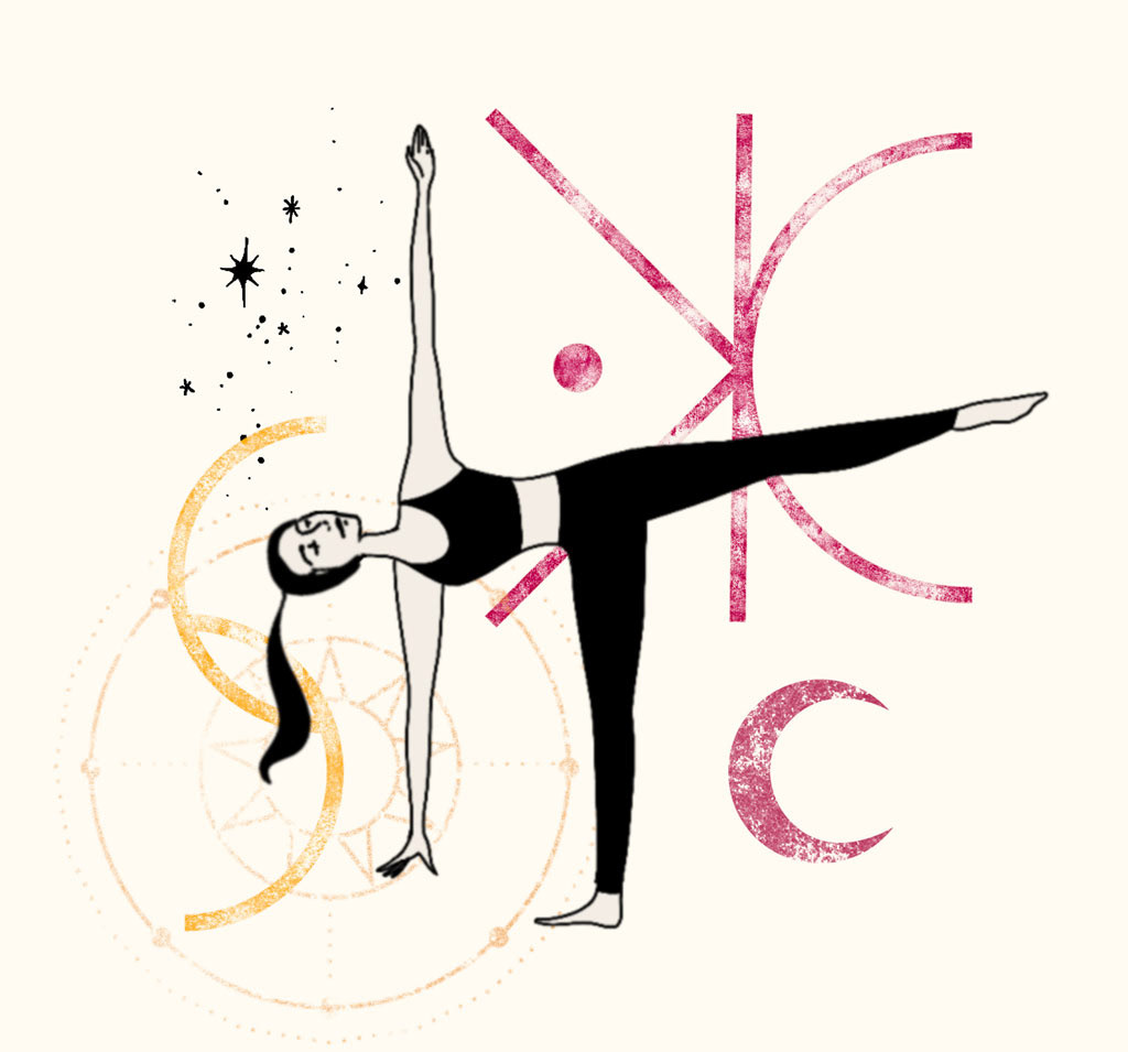
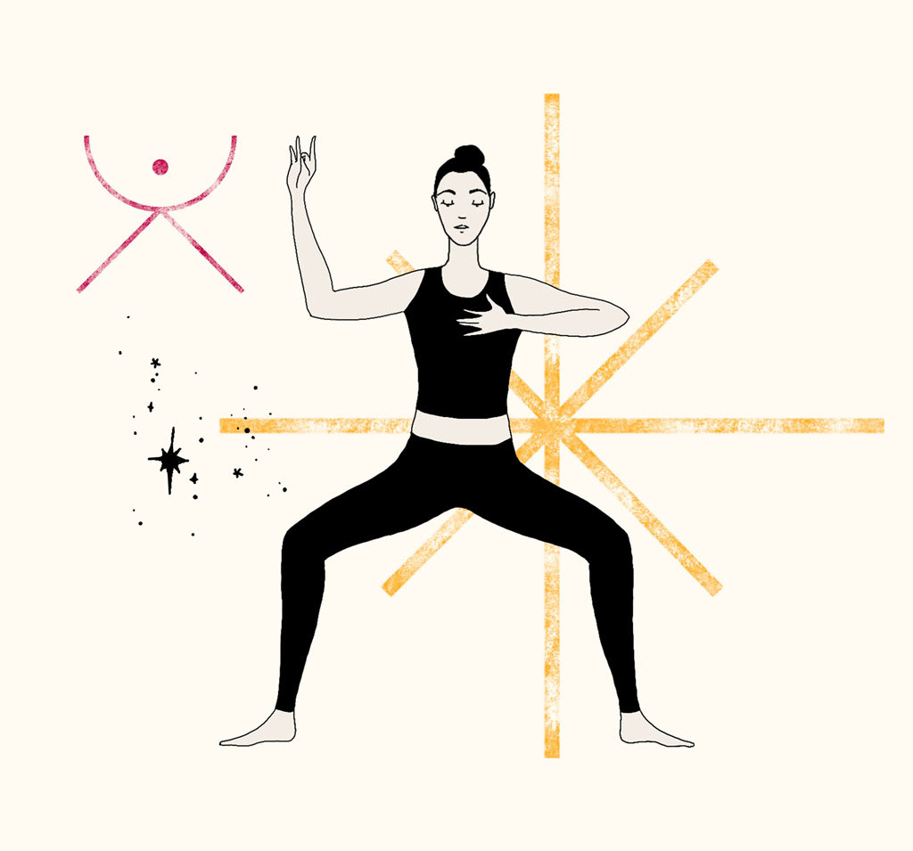
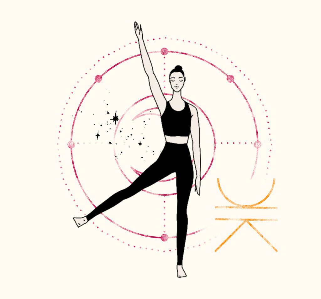
Alchemy Yoga offers more than just Yoga and Barre classes; it provides a holistic journey that transforms both body and mind. To effectively convey their values and atmosphere to their audience, I developed a cohesive logo, branding, and visual identity.
Our collaboration began with a preliminary meeting to define the brand's essence and profile the target audience. These insights were critical and informed the development of the visual identity at every stage.
After establishing the core concepts and audience profiles, I created three moodboards to encapsulate Alchemy Yoga's visual essence. We refined the chosen moodboard until it perfectly represented the desired visual atmosphere. From there, I developed a visual identity and logo that aligned seamlessly with the brand's vision.
Logo Design
The logo is an extension of Alchemy Yoga’s universe. Often the first glimpse of the brand for new students, the logo serves as the ambassador of the visual identity, representing the various facets of the project.
Symbol Design
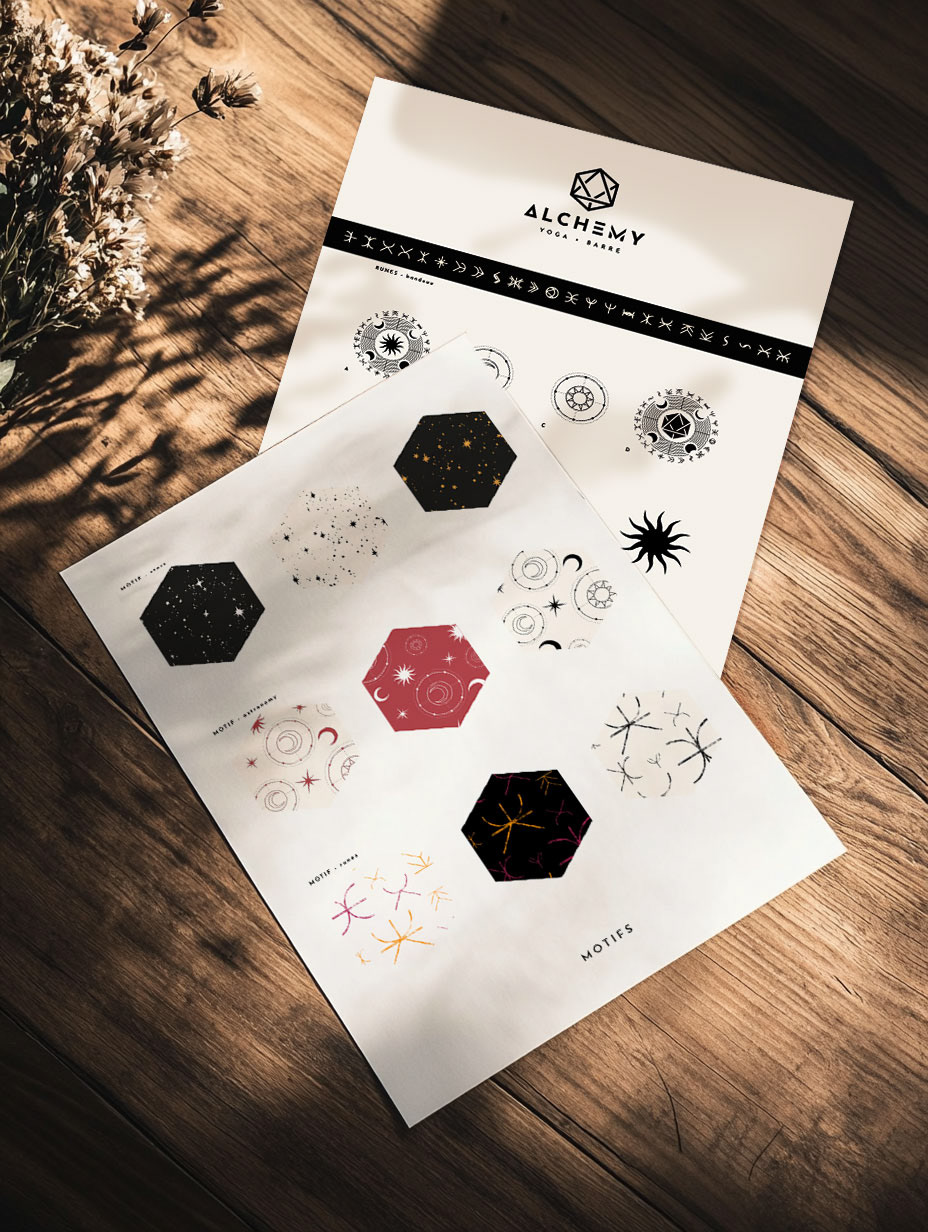
Alchemy Yoga offers diverse classes with unique atmospheres. To visually represent each class while maintaining a cohesive look, I created a system of runes inspired by Native American symbols and Nordic runes.
Each rune can be combined with a simple class symbol (two bars for barre classes, a dot for yoga classes) to form distinctive pictograms. These pictograms enhance the visual identity of the project and can be used for class-related content, like course pages and promotional materials.

